- Uses
- Integration with the Open Bee™ Portal environment
- Access the Open Bee™ eForm module
- Créer un formulaire
- Edit a form
- List of Items
- Calcul d’un élément
- SQL Query
- Import a form
- Export a form
- Google Maps API Key
- Public Forms
- Registration Procedures
Uses
The Open BeeTM eForm module offers you the possibility to create forms.
These forms allow users to interact with a document through questions.
There are many use cases, for example:
- Contact form
- Intervention Sheet
- Meeting Minutes
- Satisfaction Questionnaire
- Checklist
- Audit
- Contract
Integration with the Open Bee™ Portal environment
The Open Bee™ eForm module is fully integrated into the Open Bee™ Portal environment.
When a form is completed by a user, a document is created, filed and archived in Open Bee™ Portal.
A form is equivalent to a Ranking Rule:
- Elements in a form are metadata
- Responses to a form item correspond to metadata values
Access the Open Bee™ eForm module
The Open BeeTM Portal roles that are used by the Open BeeTM eForm are:
Forms Administration: Forms.
Fill in a form: Answer a form.
To access the Open Bee™ eForm module, click on Form in the left-hand menu.
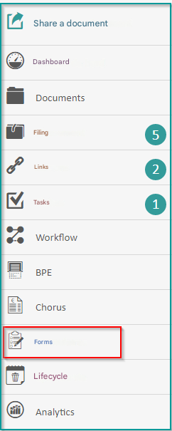
A list of existing forms is displayed. You can create a new form or edit an existing form.
Create a form
To create a new form, click on “Create Form“.
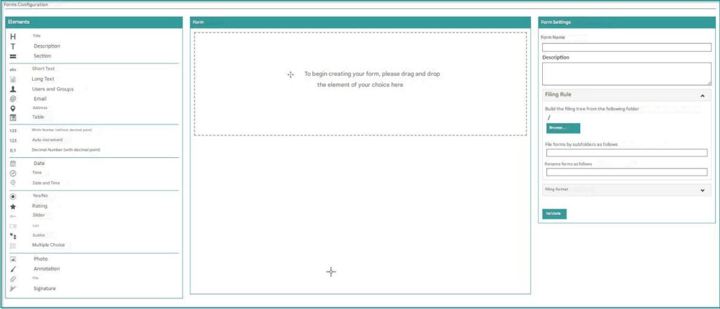
A form consists of at least one element.
There are 2 types of elements:
- Layout elements: These are used to structure the form, such as a title, description, or section. These elements do not allow the user to enter an answer.
- Questions: These are composed of a label that corresponds to the name of the question and a “Required” box to define whether the user must fill in this field when completing the form.
You can add or remove these elements from your form as needed. See the list of available items.
Add an item
To add an element to the form, drag it from the menu on the left to the body of the form.
Move an item
You can change the order of the elements that make up your form by long-clicking on an element and moving it up or down. Icon
If you’re using a Table element, you can change the order of the elements within that table.
You can’t insert an element from the form into the table. The element must be inserted directly into the table.
Similarly, you can’t remove an element from the table; in that case, you have to delete the element from the table.
Delete an item
To remove an item from the form, click the cross at the top right of the item  .
.
Item Permission
By clicking on the padlock at the top right  , you can define which users or groups of users will be able to complete this element.
A field appears to enter one or more users or groups of users.
For example, a Time Off Request form contains 2 Signature elements, one for the person who completes the form and another for a manager who will validate the request.
We don’t want the user who completes the form to be able to sign in the Manager Signature element.
For the Manager Signature element, click on the padlock and enter the user or group of users who will be able to complete this signature.
Item Keyword
This value is generated by default and used in the DOCX template to customize the layout of a form response.
See Layout.
The keywords correspond to the answers that the user will enter in the form, they are surrounded by [ ].
You can edit the keyword to make it easier to read and use in the DOCX template.
Verify that the keyword you use is unique on the form.
If the keyword is not unique in the response template, all occurrences that match the keyword will be overwritten.
Form Name
In the Form Settings column on the right, add a name to your form to make it easier to identify and find.
Ranking Rule
To categorize the responses to this form, you can specify a folder.
For subfolders, you can use elements that make up your form.
You can also choose how the form’s answer files will be named. Here, too, you can use elements.
Please note that in order to use the elements in the naming of the subfolder and responses of the form, you must first Validate the form.
Ranking Format
By default, a form’s response file is saved in DOCX format. You can choose to convert this file to PDF by checking the box.
Then, you can choose between Create a new version or Replace the current version.
If you select “Create New Version“, a DOCX version and a PDF version are generated.
If you select “Replace current version“, there will only be a PDF file generated.
To finish creating the form, click on “Validate“.
Your form is visible in the list of forms.
You can now Fill out a form.
Edit a form
You can edit a form in 2 ways.
In the list of forms, click on the “Actions” icon and then on “Edit“, or click on a form to view it and then click on the pen icon at the top right.
By editing a form, you can change the existing elements, rename them, change the order, add new elements, or delete new elements.
In the form settings, new Layout and Permissions categories are available.
Layout
In order to layout the answer files, you can use a template in DOCX format.
To download the generated template, click on “Click here to edit template“.
The generated template contains only the fields that have been saved. Validate your form before uploading and working on your template.
In the DOCX file (usable with Word, version higher than 2007), you can change the layout and move the keywords.
By default, keywords are already inserted into the DOCX file, [value_system_date], [footer] and [page].
Once you’re done with the changes, save your DOCX file. Icon
To make it easier to replace keywords in the template with user-entered values, you can change the keywords and remove the [ ].
This is because Word can interpret the [ ] as separate words and replacing keywords with values doesn’t work.
For example: you have a field called Company Name in the form, you can put as a keyword rai_soc rather than [rai_soc].
Next, you need to associate the template with the form, click on “Browse” and choose your modified template.
As soon as a user completes the form, the response file will use the custom template to make the layout of the answers.
Please note that if you add or remove fields from your form, you will need to update your custom DOCX file used for the response layout.
Permissions
Users who can edit the form
Allows you to define the groups of users or users who can administer, i.e. modify this form.
Allows you to define the groups of users or users who can complete this form.
Save the changes by clicking on “Submit“.
List of Items
Here is the list of items that are currently available:
| Name | Description | Obligatory | Multiple Responses |
|---|---|---|---|
| Title | To enter a title in the form. This is a field used by the administrator to structure the form; the user will not be able to complete it. | / | / |
| Description | Pour écrire une description du formulaire ou pour faire des sections dans le formulaire. C’est un champ utilisé par l’administrateur pour structurer le formulaire, l’utilisateur ne pourra pas le remplir. | / | / |
| Section | Allows you to create sections when the user completes the form. This is a field used by the administrator to structure the form, the user will not be able to fill it out. When the form is created, items below a section are automatically included in the section. The section is presented by its title in a banner that occupies the entire width of the screen. By clicking on the banner, the elements included in the section are hidden. By clicking again on the section, the elements are displayed. | / | / |
| Short text | Enter text on a single line. The Multiple Answers box is available to enter several values that will be displayed as “chips”. 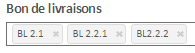 | Yes/No | Yes/No |
| Long text | Enter text on multiple lines. The maximum number of characters is 2048. | Yes/No | / |
| Username | Automatically populate this element with the name of the logged-in user. The “Allow value to be edited” checkbox allows the user to change the pre-filled value. | Yes/No | / |
| Enter an email address. | Yes/No | / | |
| Address | Enter an address on a single line. To display the Google Maps map and benefit from auto-completion when entering, You must first set up the Google Maps API key. If the map is displayed when entering the response, a screenshot of the map is saved in the response file. If the card is hidden during the response, only the text value of the address will be retained. | Yes/No | / |
| Table | To define an array of other elements. Each element corresponds to a table column. You can drag and drop the elements inside this table. When the user completes the form, he can fill in several rows of the table. | Yes/No | / |
| Integer | Enter a whole number. | Yes/No | / |
| Auto Increment | This element will be pre-filled and not editable with an auto-incremented numeric value. As soon as a new response to this form is made, the number will be automatically incremented. You can customize the initial value of the auto-increment. The label corresponds to the formatting of the auto-incremented number. The keyword [NAI] must be used to insert the auto-incremented value. For example, if you want to display BL-001, then BL-002, you will need to enter in the Label field: BL-[NAI] The number of digits is used to define the number of characters used to display the value of the auto-increment. If you want to display 001, the number of digits to use is 3. To display 0001, the number of digits will be 4. | / | / |
| Decimal | Enter a decimal number. | Yes/No | / |
| Date | Choose a date. If the System Date checkbox is selected, the item will be pre-filled with the current date and not editable. | Yes/No | / |
| Hour | Choose the time. If the System Date checkbox is selected, the item will be pre-populated with the current time and not editable. | Yes/No | / |
| Date & Time | Choose the date and time. If the System Date checkbox is selected, the item will be pre-populated with the current date and time and not editable. | Yes/No | / |
| Yes/No | Display a switch to choose a value between Yes and No. Yes and No labels are customizable. | Yes/No | / |
| Cursor | Choose a value from those proposed on a horizontal axis. For numeric values you can choose the minimum, maximum and increment value. The “Use a list” checkbox allows you to choose values from an existing Open BeeTM Portal list or create a new one. In this case, the minimum value is the first value in the list and the maximum value is the last value in the list. The increment value is forced to 1. | Yes/No | / |
| List | Choose one or more values from a list. You can use the existing lists of Open BeeTM Portal or create a new one. The “Multiple answers” box allows the user to choose several values. | Yes/No | Yes/No |
| Multiple Choice | Choose one or more values from a text list, image list, or text and image list. To change the order of the values, you must first have saved the form. The “Multiple answers” box allows the user to choose several values. Please note that lists of images and text and images are not manageable in Administration. | Yes/No | Yes/No |
| Annotation | Annotate an existing image imposed by the administrator. Or let the user annotate an image of his choice. Annotation allows you to create lines, arrows, squares, rectangles and circles and also to enter text. | Yes/No | / |
| Photo | Send an image. | Yes/No | / |
| File | Send a file. | Yes/No | / |
| Signature | Draw a cursive signature or send an image. | Yes/No | / |
Calculating an Item
Item calculation is available for the following items:
- Integer
- Decimal
- Date
- Hour
To add a calculation on an element, the element must be present in the form and it must have been saved.
Then, by clicking on the Calculate this element button, you can configure the calculation.
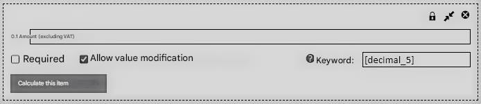
A window will open prompting you to select a metadata or operation.
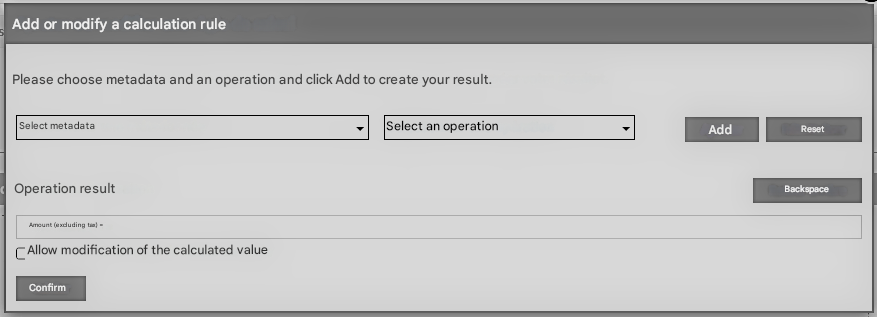
The objective is to build the calculation rule by selecting a metadata, then an operation and clicking on Add to add this selection to the calculation rule.
So the operation is built up as it goes along.
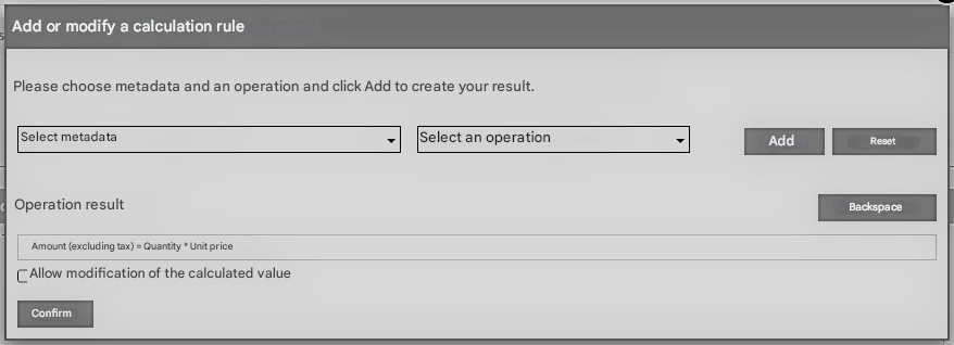
To correct the result of the operation, you can use the Backspace button, so the last part will be deleted every time.
When you have finished building your expression, you need to save by clicking on Validate.
List of operations
The list of operations can be separated into several categories:
Classical arithmetic operations:
- Addition
- Subtraction
- Multiplication
- Division
Functions:
- Average
- Percentage
- Add a percentage
- Subtract a percentage
Array-specific functions:
- Minimum of one column in the table
- Maximum of one column in the table
- Sum of a column in the table
- Average of a column in the table
- Number of rows
Date-related functions:
- Date Range
- Add to Time
Functions related to hours:
- Hour Interval
- Add to Time
Operators to manage priorities in the result:
- Opening bracket
- Closing bracket
SQL Query
As of version 6.11.0 of Open Bee™ eForm, this function has been moved to Open Bee™ Portal.
Please refer to the documentation for the SQL connectivity module of Open Bee™ Portal.
Import a form
To import a form, click on “Import“.
Choose the . JSON that corresponds to the form you want to import.
A dialog box prompts you to enter the name of the form. Icon
You cannot have 2 forms with the same name.
Click on “Validate” to confirm the name and import of the form.
The interface for editing the form is displayed.
Export a form
To export a form, click on “Actions” and then “Export“.
The form is then exported in . JSON.
The values of the lists are also exported, as well as the images of the Multiple Choice element.
Google Maps API Key
In order to use the map in the Address element, you need to set up a Google Maps API key.
Click on “Setup”, enter the key provided by Google, and then click on Validate.
The creation of this API key is free, you must first have created a Google account.
Please check with Google for usage limits on the API key. Icon
Here are the 4 APIs that need to be enabled for the Address element to be functional:
- Google Places API Web Service
- Google Maps JavaScript API
- Google Maps Geolocation API
- Google Static Maps API
Public Forms
The Public Forms feature allows you to create forms that can be accessed via a link and completed without the need for an Open Bee™ Portal user account.
This feature is included in the Open Bee™ eForm module starting with version 6.14.4 of Open Bee™ Portal.
This gateway to your Open Bee™ Portal EDM system, coupled with the workflow system, offers you many use cases:
- After-sales service
- Customer Support
- Quotations & orders
- Anonymous Survey
- Satisfaction survey
- etc.
Consult the list of public forms
To access the list of public forms, click on the “Public Forms” tab of the Open Bee™ eForm module.
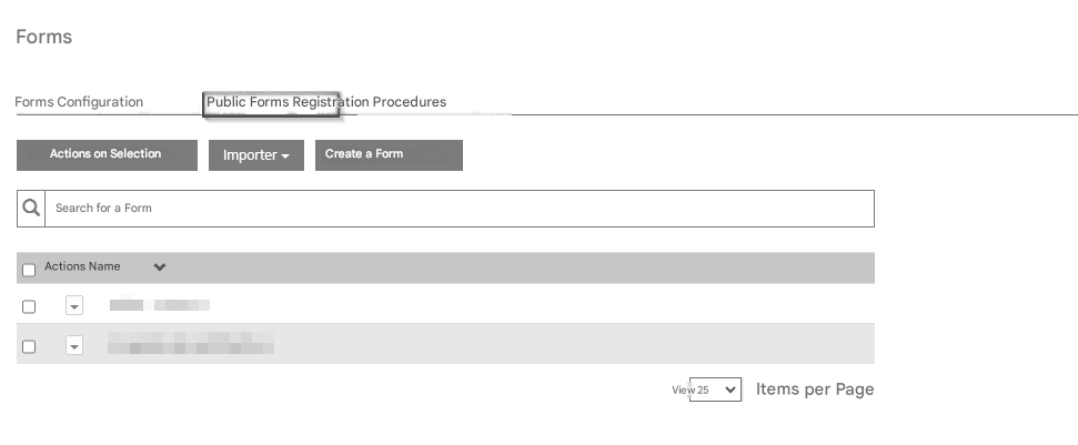
This tab allows you to:
- Configure the public form feature (1)
- create a new public form (2)
- view the list of public forms created and their status (active or inactive) (3)
- Edit or delete an existing public form
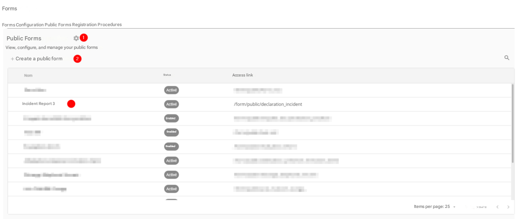
Each row in the table represents a public form. It contains the following information and actions:
- Public Form Name
- Status: Enabled or Disabled
- Access link to the public form: this url, next to the url of the Open Bee™ Portal EDM, allows access to the completion of the form.
- A button to copy the access link:
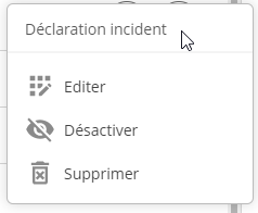
- A button to see the actions on the form:
Configure the Public Forms feature
To configure the feature, click the button  .
.
The Public Forms feature is based on the Open Bee™ eForm module. In fact, each completed form generates a document in the Open Bee™ Portal EDM: a user is required to generate this document.
The configuration of the feature allows you to choose this user.
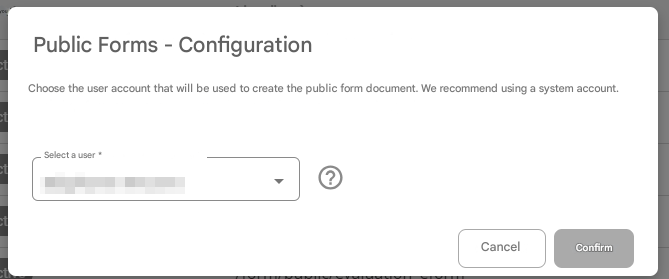
 We recommend that you choose a system user (administrator).
Create a public form
To create a new public form, click the button  .
.
The creation of the public form is done in two steps:
- Creating the “Public Form” object
- Configuring the “Form” object associated with the public form
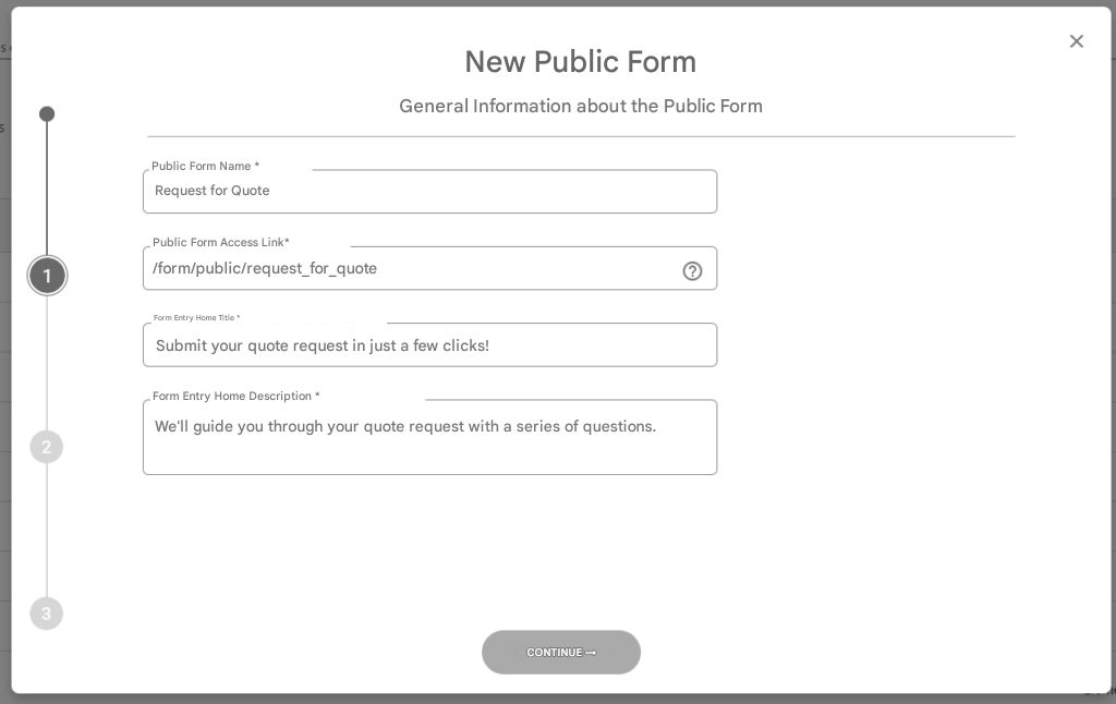
Step 1.1 – Entering General Information:
- The name of the public form as it appears in the list of public forms
- The link to access the completion of the public form
- The title and home description of the public form: this information is displayed when the public form is completed
Step 1.2 – Configure the confirmation message:
The confirmation message is a message that appears in a popup when a user submits the form.
The confirmation message is static when the public form is created:
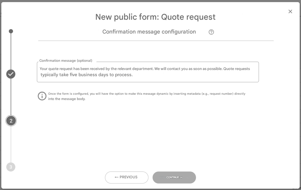
However, once the associated form is set up correctly, this confirmation message can be dynamic using the insertion of the values of the form fields entered by the user during completion:
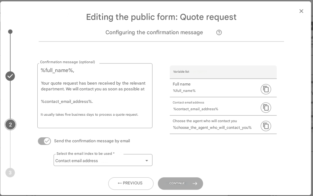
Each field in the form generates an associated variable (e.g. above: %nom_complet%), which you can use to customize the confirmation message. A button to the right of each variable allows you to copy the variable to the clipboard.
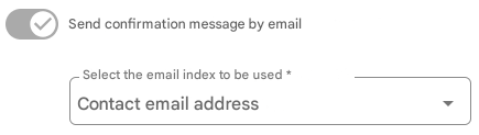
You also have the option to send a copy of this message automatically by email. The email will be sent to the value of the chosen field (which must be of type “email”).
Step 1.3 – Confirm the creation of the public form:
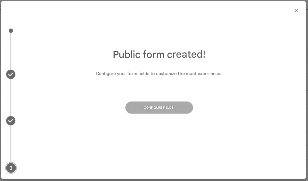
Once step 1.2 has been validated, three actions take place:
- The public form is created with the information entered
- A blank form is created and associated with the public form
- The creation wizard displays a confirmation message with a button to access the associated form configuration
Step 2 – Configure the form associated with the public form:
The configuration of the form associated with the public form is detailed in the Create Form section.
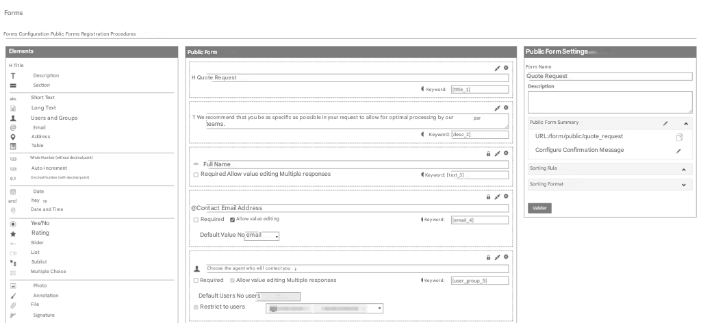
There are a few specificities to the public form to take into account:
- Calculated fields are not available
- SQL fields are not available
- The “Users & Groups” field can only work in “Restrict (choice) to (specified) users” mode
- A “Public Form Summary” section is displayed to the right of the configurator. It allows you to launch the public form editing wizard and copy the link to the public form.
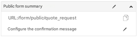
The creation and configuration of the public form is now complete and the public form is activated: anyone with the access link can now complete the form.
Registration Procedures
The Registration Procedures feature allows you to create specific public forms, intended for automated or manual user creation in your Open Bee™ Portal DMS.
Upon completion of the registration procedure, the data subject will be created a user account on the platform, either immediately or after manual verification by an authorized user of the Open Bee™ Portal DMS.
This feature is included in the Open Bee™ eForm module starting with version 6.14.4 of Open Bee™ Portal.
 Because this feature is similar to the public forms feature, only the differences will be discussed below. See Public Forms for more details.
Consult the list of registration procedures
To access the list of registration procedures, click on the “Registration Procedures” tab of the Open Bee™ eForm module.
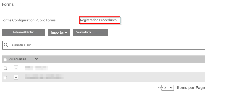
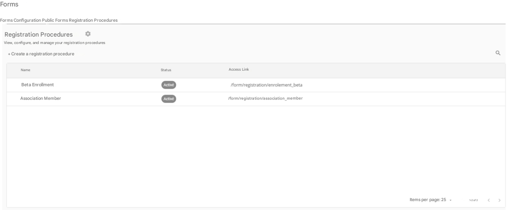
Configure the Enrollment Procedures feature
To configure the feature, click the button .
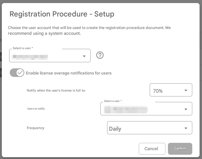
In addition to the user that will be used to generate the enrollment form document, the setup screen allows you to enable overage notifications for users.
Indeed, since the purpose of the feature is to create users, it is possible that the creation of a user will result in exceeding what is allowed by the current license.
Notifications are there to avoid this kind of situation, by allowing you to notify one or more users or groups when the number of users reaches a certain percentage of what the license allows.
Create a registration procedure
To create a new registration procedure, click the button  .
.
The creation of the registration procedure is done in two steps:
- The creation of the “Registration Procedure” object
- The configuration of the “Form” object associated with the registration procedure
Step 1.1 – Entering General Information:
- The name of the registration procedure as it appears in the list of registration procedures
- The link to access the completion of the registration procedure
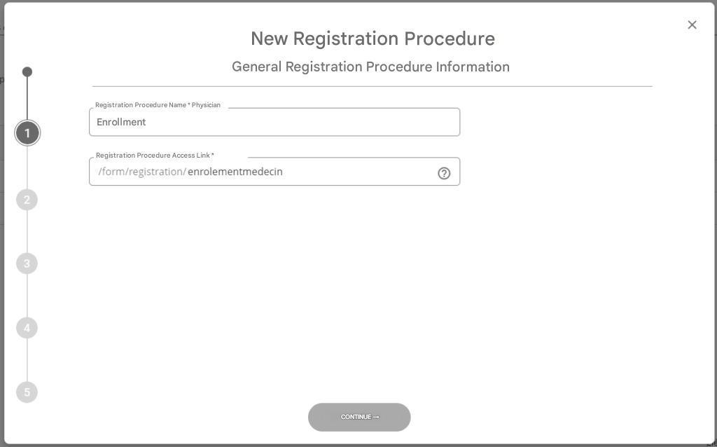
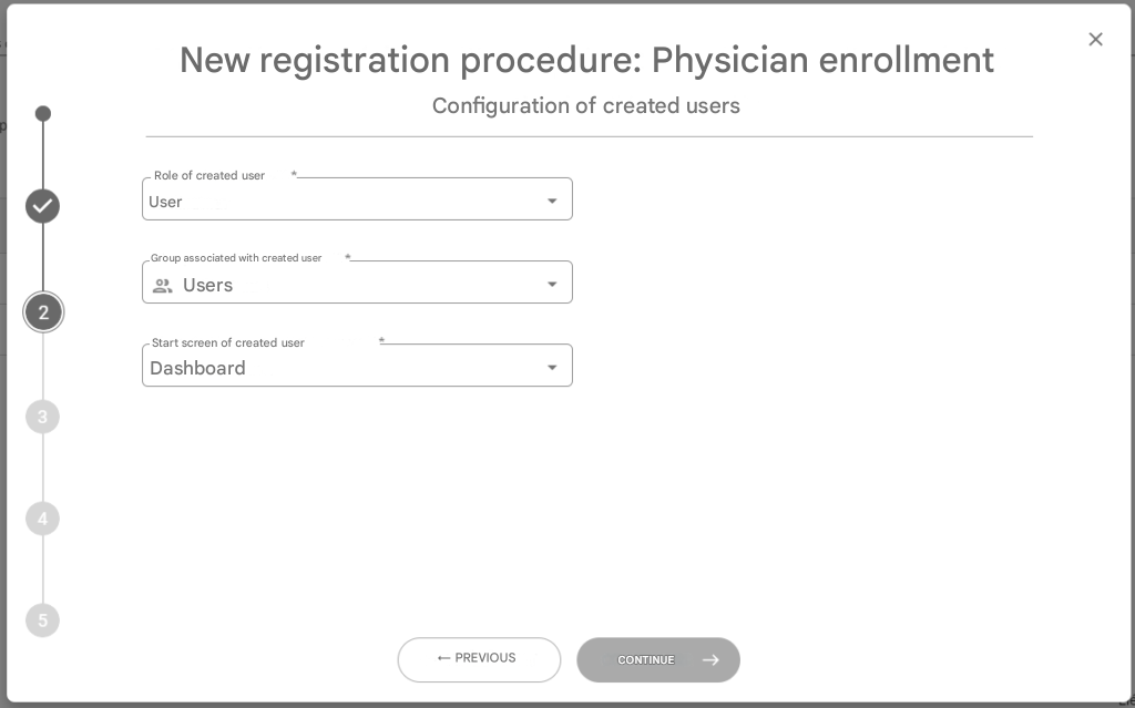
Step 1.2 – Configure the created users:
This step allows you to define the characteristics of the users that will be created by the registration procedure in the Open Bee™ Portal EDM:
- The role of the user created
- The group to which the created user will be associated
- The user’s splash screen created
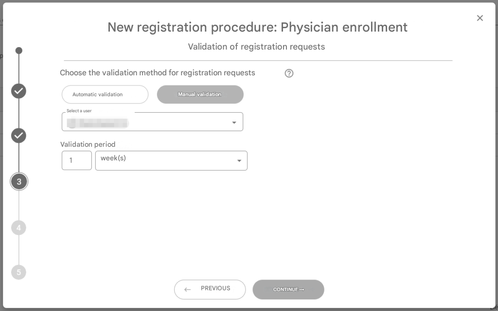
Step 1.3 – Configure the validation mode of the registration procedure:
There are two ways to validate the enrollment request for the enrollment process:
- In “Automatic Validation” mode, the user account is automatically created by the system at the end of the registration procedure by the person.
- In “Manual Validation” mode, a validation task will be created at the end of the person’s completion of the registration procedure. This task will be associated with the users and/or groups chosen in this step.
Step 1.4 – Setting up the confirmation message
See Public Forms for more details.
Step 1.5 – Confirm the creation of the registration procedure
See Public Forms for more details.
Step 2 – Configure the form associated with the registration procedure:
The configuration of the form associated with the registration process is detailed in the Create Form section.
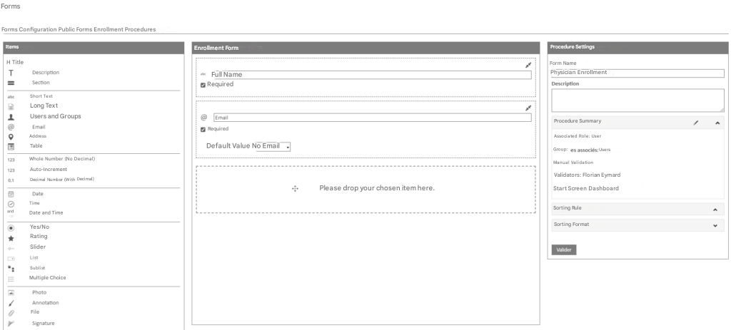
There are a few specificities to the registration process to take into account:
- Calculated fields are not available
- SQL fields are not available
- The “Users & Groups” field can only work in “Restrict (choice) to (specified) users” mode
- A “Short text” field and an “Email” field are present by default in the form and are not deleteable. They are used as information when the user is created.
- A “Procedure summary” section is displayed to the right of the configurator. It displays the information of the registration procedure and allows you to launch the wizard for editing the registration procedure.
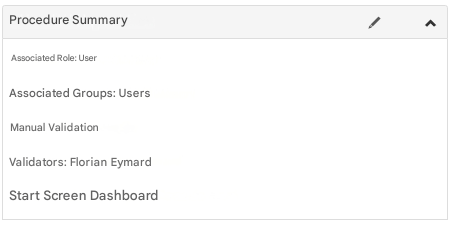
The creation and configuration of the registration procedure is now complete and the registration procedure is activated: anyone in possession of the access link can now complete the form.